It’s been almost a year since Google started working on giving Chrome OS some darker hues. Despite dark mode’s long development time, it still looks pretty unfinished today (even in Canary), and we’ll probably be waiting for some time before Google officially launches it. With the highly requested feature slowly trekking its way towards the finish line, Google has been steadily rolling out updates that introduce new sprinkles of dark theme goodies, like dynamic theme switching and scheduled dark mode. And now, Google Assistant is raring to embrace its new goth makeover.
We’ve been tracking Google’s efforts to add dark and light system themes to Chrome OS since September of last year, and since then, more details have been trickling out from the Chromium Gerrit. There’s ongoing work to ensure Chrome OS applies dark mode everywhere — including Google Assistant, as mentioned in this merged commit. If you’re rocking the latest Canary channel build on your Chromebook, you’ll be able to get a glimpse of the Assistant’s goth look by flipping on the following Chrome flag in bold:
Enables the dark/light mode of system UI, which includes shelf, launcher, system tray etc. – Chrome OS
To enable it, copy the text above into Chrome’s address bar, select Enabled from its drop-down menu, and restart your Chromebook. If your desktop starts using a light theme when it comes back up, open the system tray and click on the Dark theme toggle (Assistant also has a new light theme — more on that later).
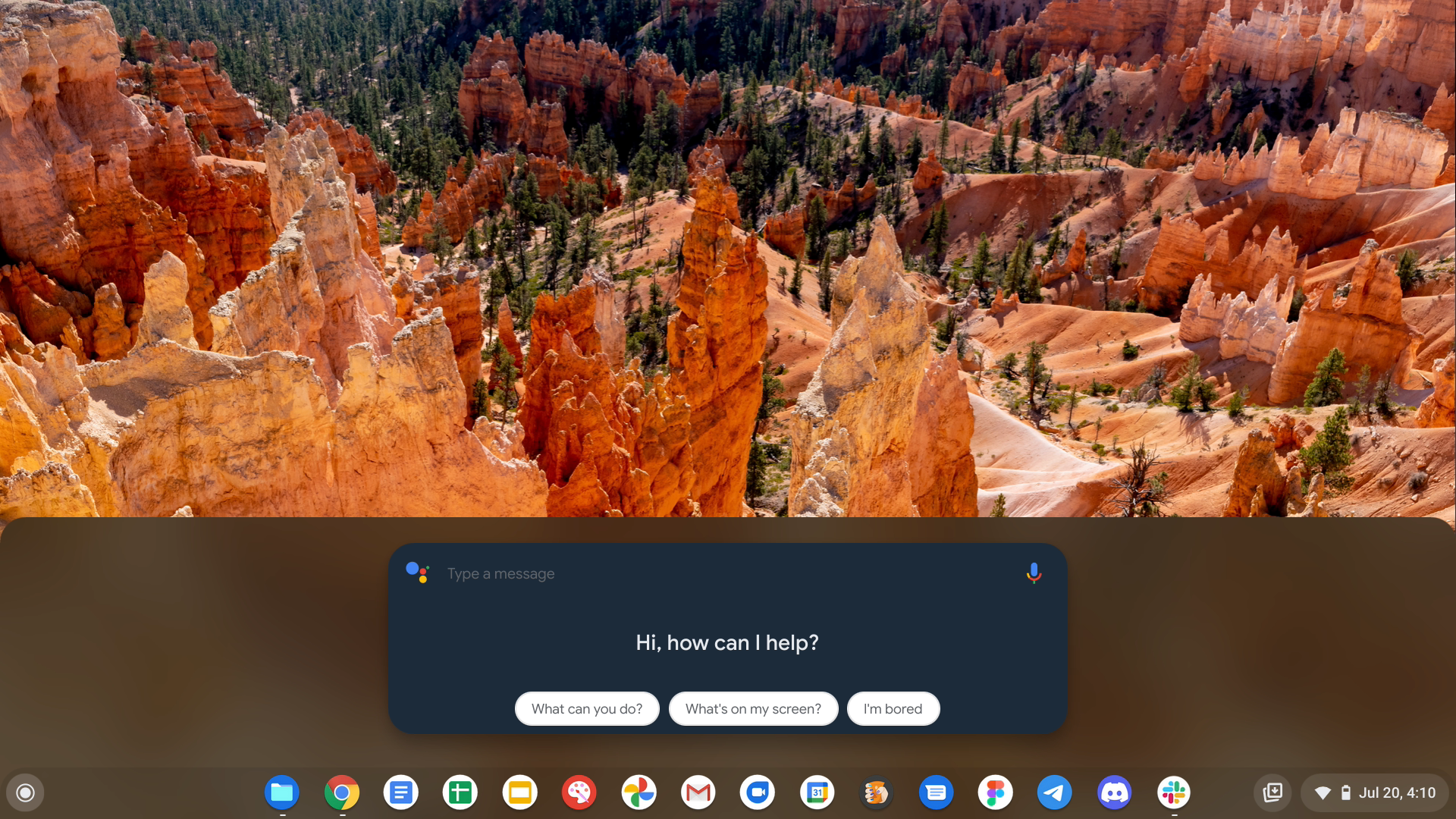
An early look at Google Assistant’s new dark theme.
The most significant change you’ll see with the updated Google Assistant is its dark card UI. It does away with the white and adopts a sleek, dark hue that is both aesthetically pleasing while being easy on the eyes. It’s evident that its dark makeover is far from complete, though, with suggestions and answers still using the old light color. There’s an in-progress commit that will extend its darker hues to various parts of the Assistant, but we’ll need to wait for a future update to see it.
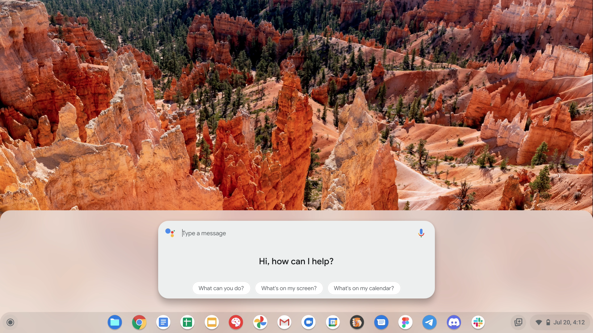
Google Assistant also gets a slight color change with light theme.
The Google Assistant UI is also getting a subtle update when using the upcoming Chrome OS light theme. It doesn’t switch over cleanly when you toggle off Dark mode, but if you restart your Chromebook again, you’ll notice the change more clearly: It adopts a light gray color instead of its solid white look, which — I’ll be honest — looks a little strange. I think Google Assistant isn’t properly extracting the colors from the wallpaper right now, but that may change soon.
It’s been a long and gradual effort to get dark mode into Chrome OS, but with small changes like this, it’s getting tantalizingly close to finally making its way to everyone. Google still has some polishing to do before everything’s ready — the inability to apply dark elements across various UI elements is a reminder that this won’t arrive overnight. Many of us have grown to love dark mode on our devices, and I think it’s imperative of Google to get this right. Let’s not forget about the blindingly white startup animation, Google!
Google Assistant is going goth, with dark mode coming to a future Chrome OS update
Source: Poinoy Wattpad


Post a Comment