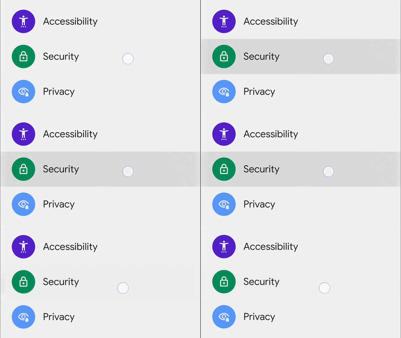
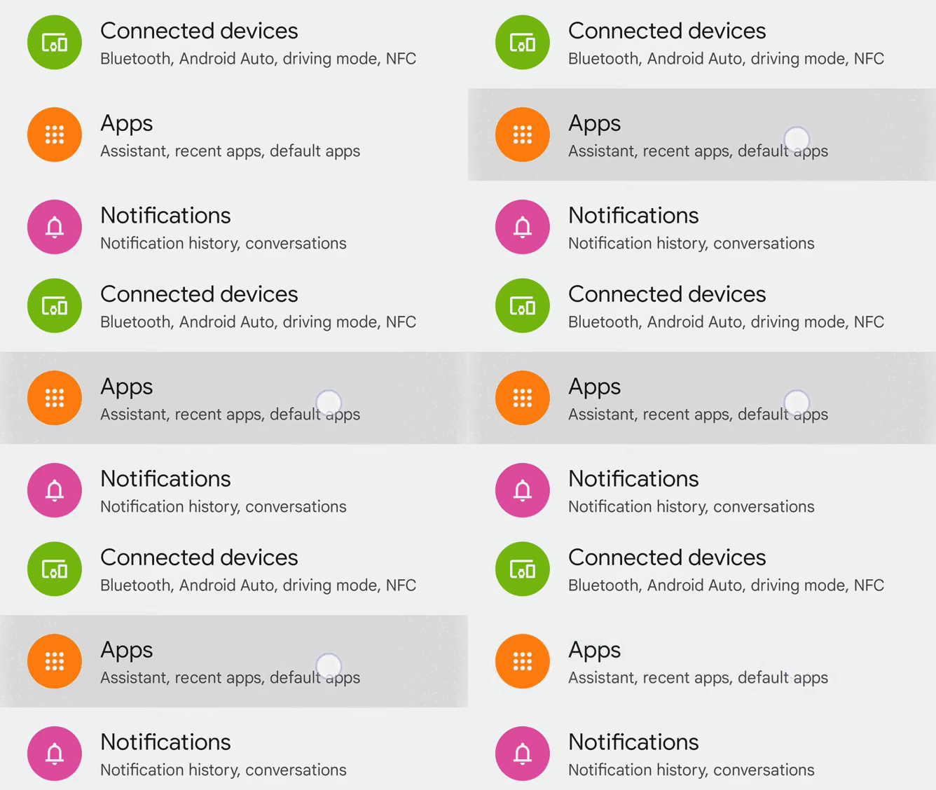
For the aesthetic obsessives out there, it’s been an especially interesting beta cycle so far with Android 12. Material You brought a major tweak to the ripple animation and, if you asked certain critics about it, you would’ve thought Google had gone mad at the craft store for bottles of sparkles. Has relief come its way?
After the company promised to let go of the gas pedal on the sparkly ripple animations in future betas, we’ve just turned from page one to page two of the Android 12 beta process. The changes that come with it are extremely subtle at best.
The sparkly bits are still there, but they seem to be less prominent now than they were before. Take the ripple animation for a system settings item in Beta 1 above and compare with the example from Beta 2 below.
The particles may have decreased in size and/or number, but it’s a barely noticeable change that may or may not make the difference in a half-second animation that links to a more substantive animation like a screen change.
The notification shade buttons still sparkle when you press and hold a tile. There doesn’t seem to be much of a shift there.
You can get a better sense of the changes (or lack thereof) in the notification shade and settings with a couple of demo videos we’ve put together below. You’ll want to pull them up fullscreen for full effect.
And beta 2. Still quite sparkly. pic.twitter.com/0Smx80xQ23
— Artem Russakovskii (@ArtemR) June 9, 2021
Press a dark-colored button, though, and watch the sparks fly. This example comes from the Calculator app with the dark theme on.
This has not changed with Beta 2.
Is all of this still over the top? Distracting? Out of place? Maybe another hundred threads in the Google IssueTracker will tell us. In the meantime, we may see further toning down with Beta 3.


إرسال تعليق